

Quick answer: Microsoft Planner plans are isolated inside their own groups, so no plan can see what a person is committed to elsewhere. There are four practical ways to get a capacity picture across several plans: consolidate manually in a spreadsheet, use the Planner Premium workload view plan by plan, build a Power BI report over the Microsoft Graph API, or add a portfolio layer that reads every plan and holds a capacity model above them. Which one fits depends on how many plans you have, how often you need the answer, and who will maintain it.
This is the practical companion to the wider question of resource management in Planner.
Why this is hard by design
Planner was built so any team can start a plan in ninety seconds. That speed comes from each plan living inside its own Microsoft 365 group, self-contained and independent.
The consequence is that a plan has no knowledge of any other plan. If someone is on four plans across three departments, each of those plans shows a quarter of the truth and none of them can assemble the rest.
There is also no capacity record — no working calendar, no FTE percentage, no statement of hours available. So even a complete picture of assignments across every plan would still be missing the denominator that turns allocation into a percentage.
Any method below has to solve both problems: see across plans, and supply the capacity figure Planner does not hold.
Method 1: Manual consolidation
Someone opens each plan, filters by assignee, and rebuilds a picture in Excel each planning cycle. Availability is typed in by hand from what people know about contracts and leave.
When it works: below about ten plans, with a stable set of people, and where the question is asked quarterly rather than continuously.
Where it fails: it is accurate on the day it is built and decays immediately. It also relies on task counts rather than effort unless someone estimates hours manually, and nine small tasks look like a heavy load next to one large one.
Do not dismiss it. For a small portfolio it is genuinely the right answer, and a spreadsheet that gets updated beats a tool nobody opens.
Method 2: Planner Premium workload view
Premium adds a workload view showing effort distribution across the people on a plan.
When it works: a single project with a mostly dedicated team, where the question is whether the load is balanced within that project.
Where it fails: it is scoped to one plan. It compares people against each other on that plan rather than against their total commitments, so a person who looks comfortable here may be badly over-committed once their other three plans are counted. It also requires Premium licensing, and Basic plans are out of scope.
Method 3: Power BI over the Microsoft Graph API
Pull task and assignment data from every plan through Graph and build a consolidated report.
When it works: you have someone who owns Power BI and Graph, you need the view refreshed continuously, and you are willing to maintain it. This method reaches Basic plans, which is a real advantage over Premium's native view.
Where it fails: it is a build rather than a product. Somebody writes it, and somebody maintains it when the schema, the permissions or the requirement changes. More fundamentally, it can only report what Planner stores — so it gives you assignments across plans, but the capacity figures still have to come from somewhere else and be joined in by hand.
Many organizations end up here and then discover the second half of the problem was never the reporting.
Method 4: A capacity model above the plans
Keep the plans where they are and hold the capacity model separately: a resource pool with real availability, allocation to initiatives in hours or percentage FTE, and delivery progress read live from the plans themselves.
When it works: people are shared across initiatives, the question gets asked continuously rather than quarterly, and some of the work happens outside Planner.
Where it costs: it is another system, and someone has to keep allocations current — though not task-level detail, which stays in Planner where teams already maintain it.
Choosing between them
Three questions settle it faster than a feature comparison.
How many plans, and how much overlap? Under ten plans with mostly dedicated teams, manual consolidation is fine. Above that, or wherever the same specialists appear repeatedly, it stops scaling.
How often do you need the answer? Quarterly tolerates a manual method. Continuously does not — a picture that is right on Monday and wrong by Thursday is worse than no picture, because people act on it.
Who maintains it in year two? The Power BI route is genuinely good until the person who built it changes jobs. Ask this before starting, not after.
How PPM Express Enterprise does it
The resource pool records each person's real availability, and allocation to initiatives is entered in hours or as a percentage of FTE across periods. Demand can be modelled by role and skill before named people are chosen, which is how planning conversations usually start.
The pool reads as a table for detail and a histogram for pattern, so over-allocation appears as a shape rather than a number somebody has to spot.
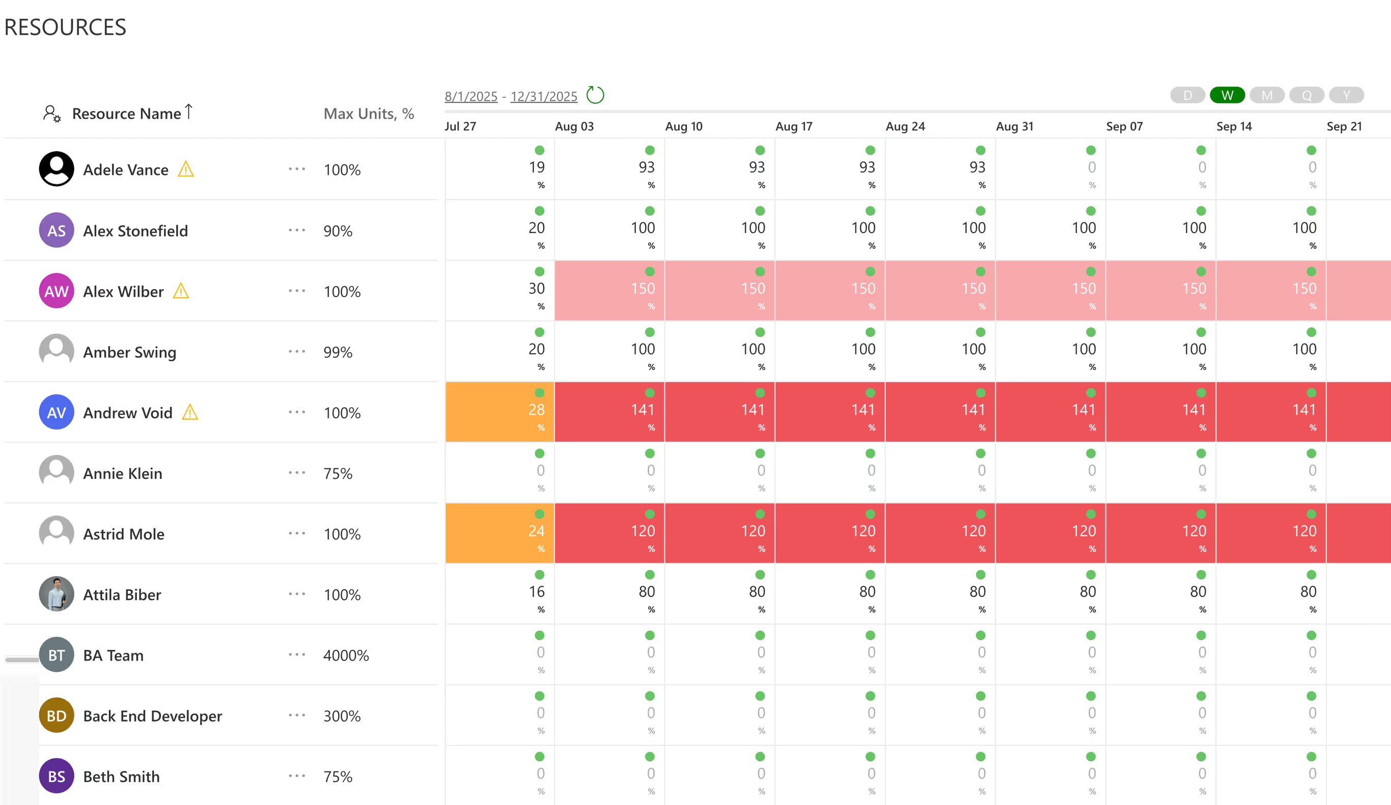
Progress underneath comes from the plans themselves — Basic and Premium, including plans created in Teams — read live and never written back. Jira, Azure DevOps, Microsoft Project, Smartsheet and monday.com feed the same pool, which matters because shared specialists tend to be shared across tools too.
Frequently asked questions
No. Each plan sits inside its own Microsoft 365 group and cannot see the others, and Planner stores no availability figure in either edition. Cross-plan capacity requires consolidating the data somewhere outside Planner.
Only within a plan. It shows effort distribution across the people on that plan, which is useful for balancing one project, but it cannot account for what those people are committed to on other plans.
It can give you assignments consolidated across plans, including Basic ones, via the Microsoft Graph API. It cannot supply availability, because Planner does not store it — capacity figures have to be joined in from elsewhere, and the report has to be built and maintained.
Roughly ten, though overlap matters more than count. Twenty plans with dedicated teams are easier than eight plans that all depend on the same four specialists.
Not if the capacity model sits above Planner. PPM Express reads Basic and Premium plans identically, so the capacity view does not depend on which Microsoft tier a team holds.
The short version
Cross-plan capacity is hard in Planner for two reasons that no amount of plan hygiene fixes: plans cannot see each other, and there is no availability figure to compare allocation against. Manual consolidation works below about ten plans. Premium's workload view works within one plan. Power BI over Graph reaches every plan but still cannot supply capacity. A model held above the plans solves both halves, at the cost of being another system to keep current.
Pick by how often you need the answer and who will own the method in a year — those two questions eliminate most of the options on their own.
.svg)


