

Quick answer: A PMO dashboard is a live visual summary of project or portfolio health (status, budget, resourcing, risk), built for one specific audience so they can make a call without pinging someone for a report. The dashboards that survive past month three share three habits: they're built for one audience at a time, they hold to a small set of decision-critical metrics, and one named person is on the hook for keeping the numbers honest.
A common pattern is not too few dashboards but too many, most of which nobody trusts, built for an audience of everyone and therefore nobody. If you're about to build (or rebuild) yours, it's worth starting somewhere other than "which KPIs should we track."
What should a PMO dashboard include?
A PMO dashboard should include the small set of metrics that would change what its specific audience does next: typically status and health, budget planned versus actual, resource capacity against demand, and the few risks live enough to act on. The right contents depend on the decision it supports: an executive sponsor deciding whether to keep funding an initiative needs different numbers from a resource manager deciding who to assign next week.
Why most PMO dashboards quietly die
Here's the pattern, if you've been around a PMO for more than a year: someone builds a beautiful dashboard. It has fifteen widgets. Leadership loves it in the kickoff meeting. Three months later, nobody's updated the RAG statuses, the budget numbers are two sprints stale, and everyone's back to asking their PM for a status email.
The dashboard didn't fail because the tool was wrong. It failed because it tried to answer too many questions for too many people at once. A portfolio dashboard built to satisfy an executive sponsor, a resource manager, and six project managers simultaneously ends up satisfying none of them. It's too shallow for the exec and too high-level for the PM doing the work.
The fix isn't a better chart library. It's picking an audience before you pick a metric.
Start with who's looking, not what you're tracking
Every dashboard exists to help one type of person make one type of decision faster. Work backward from that:
- Executive sponsors want to know: is this still worth funding, and is it on track strategically? They need portfolio-level ROI, strategic alignment, and a small number of flagged risks, not task lists.
- PMO directors want to know: where's the bottleneck? They need intake volume, resource capacity versus demand, and delivery throughput across the portfolio.
- Resource or team managers want to know: who's overbooked and who has room? They need allocation percentages, utilization trends, and upcoming availability.
- Project managers want to know: what's at risk this week? They need task-level status, blockers, and dependencies: the detail everyone above them explicitly doesn't want.
Once you know who's opening the dashboard, the metric list writes itself.
8 PMO dashboard examples, organized by the decision they support
Rather than splitting these by "project" versus "portfolio" (the usual way vendors slice this up), it's more useful to organize them by the question each one is meant to answer. That's the test for whether a dashboard earns its place: can someone look at it and act, or is it just decoration?
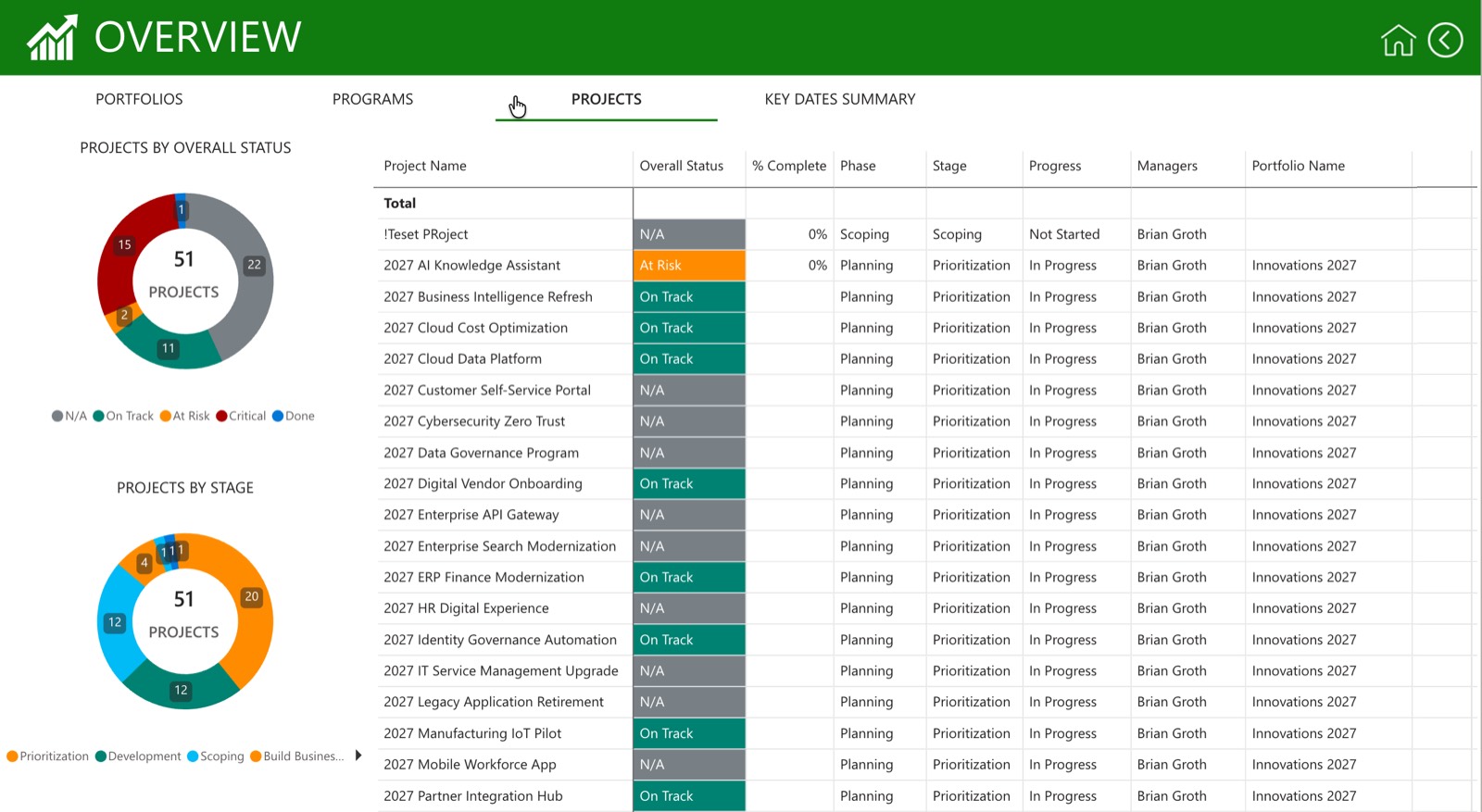
1. Executive portfolio dashboard: "should we keep funding this?"
Rolls up every active initiative into a single view: RAG status by project, portfolio budget consumed versus planned, ROI or value delivered, and a short list of the top 3-5 risks across the whole portfolio. For most executive audiences a weekly or biweekly refresh is enough; they need the numbers to be trustworthy more than they need them to be instant.
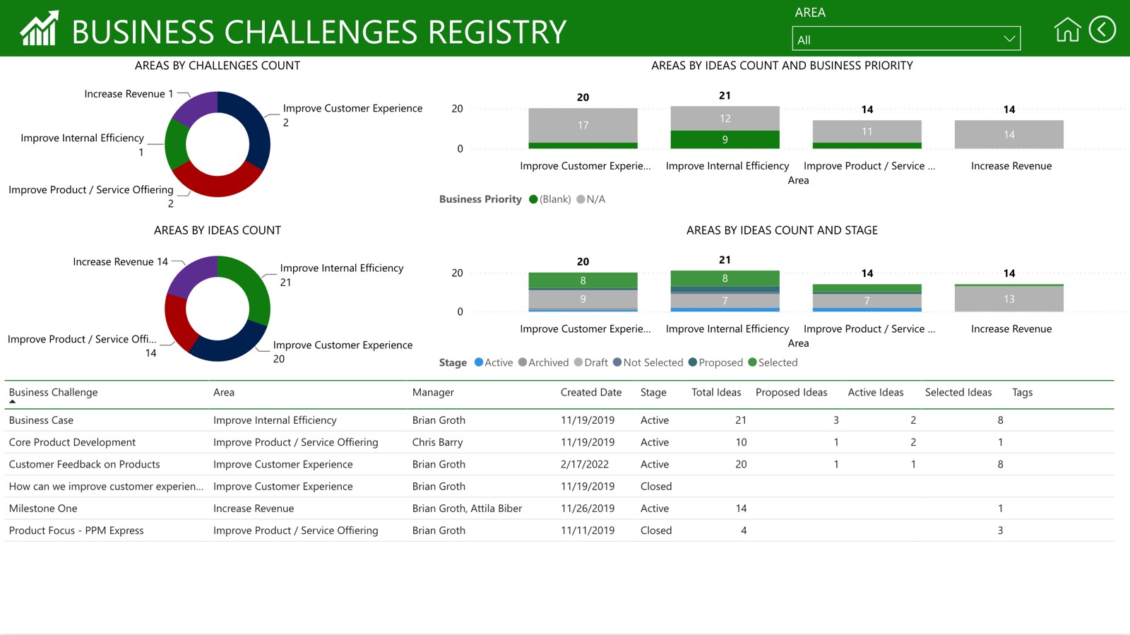
2. Intake and demand dashboard: "what should we say yes to?"
Tracks incoming project requests, backlog size, and requests by priority tier, alongside approval and rejection rates. This is the dashboard that keeps a PMO from becoming an order-taking department: it makes the intake queue visible instead of living in someone's inbox.
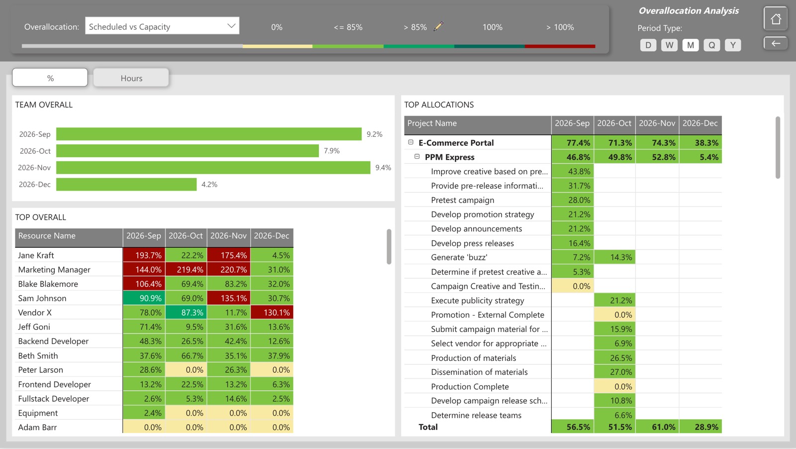
3. Resource capacity dashboard: "do we actually have the people?"
Shows utilization rate by team or role, available versus required capacity, and where bottlenecks are forming before they blow a deadline. In organizations still running resourcing out of spreadsheets, this single dashboard tends to have the fastest payback of anything on this list. Our resource capacity planning guide covers how the underlying number is calculated.
4. Budget and CAPEX/OPEX dashboard: "are we spending where we said we would?"
Planned versus actual spend, cost performance index, and (for organizations that have to report this way to finance) a capital-versus-operating expenditure split by project or phase. This is the dashboard finance actually reads, so accuracy matters more here than anywhere else.
5. Risk and RAID dashboard
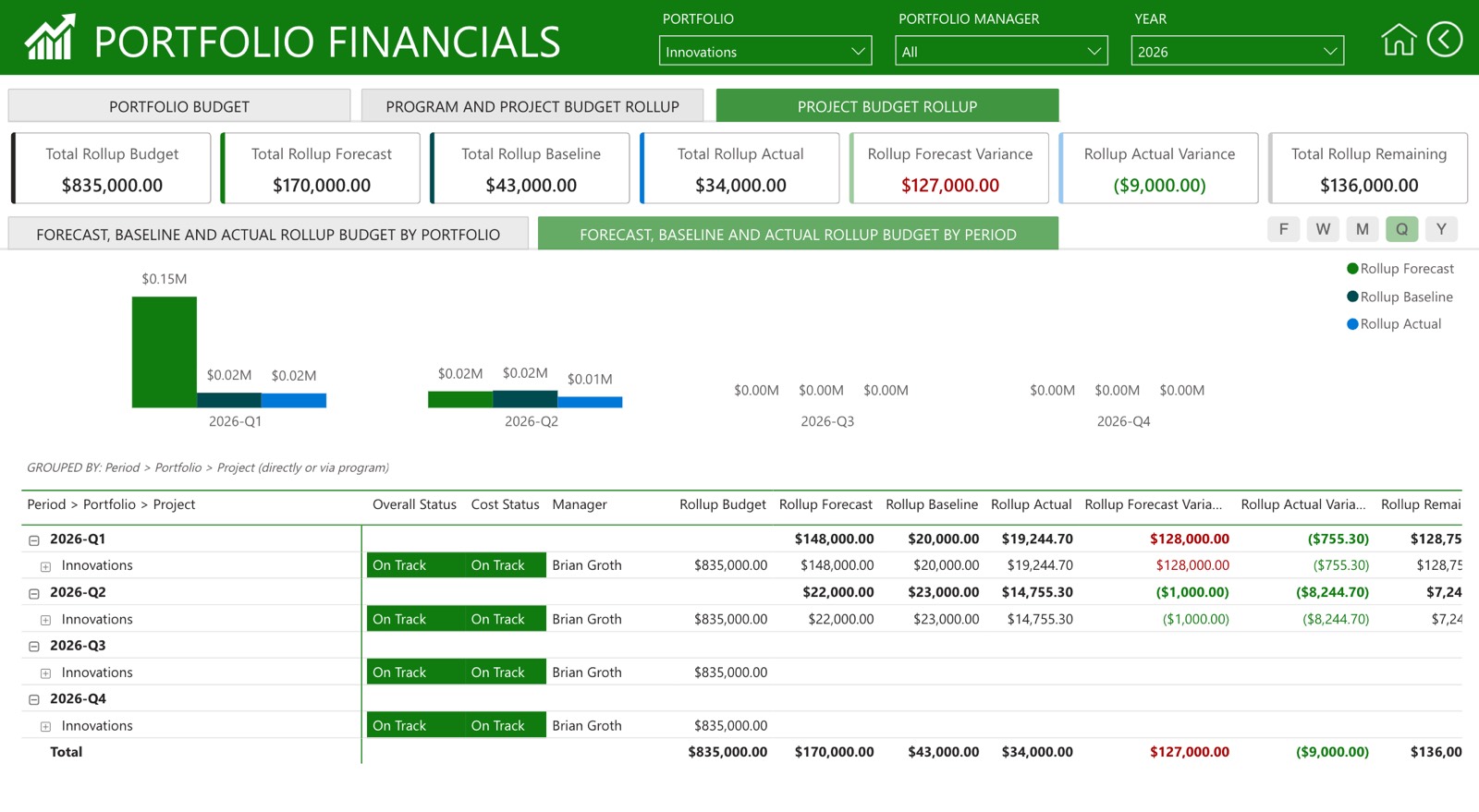
A live view of Risks, Assumptions, Issues, and Dependencies (RAID) across active projects, typically filtered to items above a certain severity threshold. A frequent mistake here is logging every risk ever raised instead of surfacing what's actually live: a RAID dashboard with 200 rows gets ignored exactly like a status report with 200 lines.
6. Project health dashboard (RAG status)
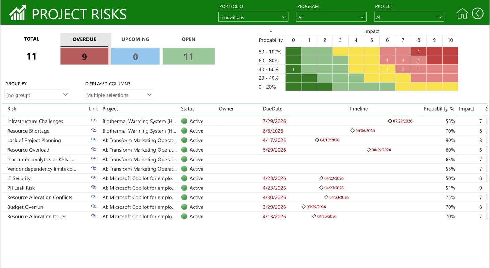
The workhorse: status, percent complete, milestone progress, and upcoming deadlines for a single project or a small set of related ones. Keep it to the handful of indicators that would actually change what a PM does next; completion percentage alone doesn't tell you whether a project is in trouble.
7. Program or stage-gate dashboard
Built for programs running formal phase reviews (new product development is the classic case): approval status at each gate, budget by phase, and milestone progress rolled up across the program. This one earns its complexity because gate reviews are genuinely a different kind of decision than day-to-day status.
8. Scenario comparison dashboard: "what happens if we fund this instead of that?"
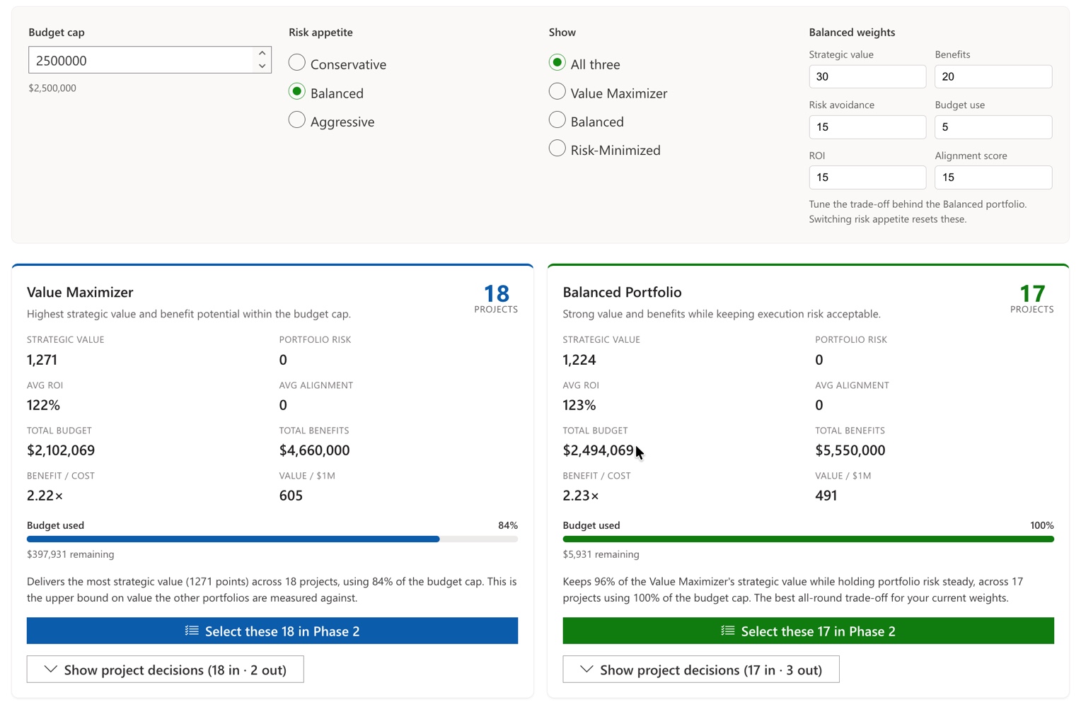
The one most PMO dashboard round-ups skip, because many PPM tools can't produce it. When you're weighing two or three funding scenarios against the same limited budget and resource pool, a status dashboard doesn't help; you need to see the trade-offs side by side. This is what PPM Express's Scenario Planner is built for: model competing prioritization scenarios against real capacity and budget constraints, compare them, and publish the one leadership picks back into the live portfolio.
How many metrics a dashboard should carry
Every dashboard example above works because it resists the urge to show everything. For executive dashboards, start with a small set of decision-critical metrics (often around five to seven) and add detail only when it supports a decision. That range is a starting point rather than a rule; an operational dashboard a delivery team works from all day can reasonably carry more, and a single-decision executive view can carry fewer.
The underlying test isn't the count. It's whether each number would change what the viewer does next. If a metric wouldn't, it belongs a level down in the detail rather than on the front page. You can always drill in, and you can't un-clutter a dashboard nobody opens anymore.
Where the data actually has to come from
This is where PMO dashboard projects tend to get harder than the diagrams suggest. In practice, the data lives in several places at once: task and schedule data in Azure DevOps, Planner, Jira, or Project Online; budget data in an ERP or finance system; resourcing in a spreadsheet somebody maintains manually; and risk logs in yet another tool entirely. A dashboard is only as trustworthy as its least-current data source, which is why PMOs on Microsoft 365 tend to get more mileage out of a PPM layer that connects natively to Planner, Azure DevOps, and Project Online than out of rebuilding those integrations by hand in Power BI every time a source system changes.
Mistakes that kill dashboard adoption
- Building one dashboard for every audience. Covered above, but it's among the biggest causes of dashboards nobody trusts.
- Stale data with no owner. A dashboard is a promise that the numbers are current. Assign a named owner per data source, not "the PMO" in the abstract.
- Too many metrics, not enough decisions. More charts isn't more insight.
- No action attached to red status. If a metric turning red doesn't trigger a defined next step, it's not a management tool. It's wallpaper.
- Never revisiting the layout. The dashboard that mattered at portfolio kickoff isn't the one that matters six months in. Revisit periodically.
Building your first PMO dashboard: a four-step version
1. Pick one audience and one decision. Not "give leadership visibility": something more specific, like "let the sponsor decide whether to keep funding project X next quarter."
2. List the handful of metrics that decision actually needs (five to seven is a reasonable starting point) and identify exactly where each one lives today.
3. Prototype it in whatever tool your data already lives in. Don't buy a new tool before you've proven the metrics matter: a rough version in your existing PPM platform will tell you more in a week than a polished spec will in a month.
4. Put someone's name on it. A dashboard without an accountable owner degrades quickly, no matter how good the initial build was.
Frequently asked questions
It depends entirely on the audience. Executive dashboards typically need portfolio ROI, budget variance, and top risks. Delivery-focused dashboards need schedule variance, task completion rate, and resource utilization. The mistake is picking KPIs from a generic list instead of from the specific decision the dashboard supports.
A project dashboard tracks the health of one initiative: status, tasks, milestones. A portfolio dashboard rolls multiple projects up into comparative, strategic-level metrics like budget allocation across the portfolio, risk exposure, and resource capacity versus demand across everything in flight at once.
Update frequency should match the decision cadence and the volatility of the portfolio. Operational dashboards used daily benefit from near-real-time data where source systems support it; executive and portfolio-level views tied to a weekly or monthly governance rhythm are usually fine refreshed on that rhythm. What matters more than raw frequency is that the cadence is consistent, known, and at least as fast as the decisions being made from it.
Many PMOs blend a dedicated PPM platform for portfolio-level views with Power BI or Excel for ad hoc analysis. Organizations running on Microsoft 365 increasingly prefer a PPM layer that pulls directly from Planner, Azure DevOps, and Project Online, since it removes the manual reconciliation step between the PM tools people actually work in and the dashboard leadership looks at.
The short version
A PMO dashboard is only as good as the decision it's built to support. Pick the audience first, keep the front page to the metrics that would change someone's next action, name an owner for the data, and treat "what happens if we fund this instead" as its own dashboard rather than trying to bolt scenario comparison onto a status report. Get those four things right and the dashboard earns a permanent spot in someone's weekly routine instead of becoming the thing nobody opens after the second month.
Getting a dashboard people actually open every week usually comes down to exactly what this piece describes: a small number of metrics, pulled from wherever the real work already lives, without someone rebuilding it by hand every Friday. PPM Express dashboards pull directly from Azure DevOps, Jira, and Planner, so the numbers stay current without the manual reconciliation step this article is warning against. Worth a look if your current dashboard is the kind nobody opens after the second month.
.svg)


