

Quick answer: A Microsoft Planner executive dashboard needs to answer three questions: what needs a decision, what changed since last time, and what's genuinely at risk. It's not a count of how many tasks exist. Microsoft Planner's Charts and Insights views are built for one plan at a time, and even Planner Premium's Portfolios feature rolls up tasks, not risk or decision context. Once a portfolio spans five, ten, or more plans, nothing in Planner natively answers "what's the state of my portfolio." This article works through a five-plan example and compares the three real ways to close that gap: Planner Agent, Power BI, and a hosted portfolio layer.
If you're the PM filling out a weekly status update for a single plan or program, a companion article, Status Reports for Microsoft Planner, covers the template, cadence, and field-by-field mechanics of that job. This article is for the reader one level up: the PMO lead or executive sponsor who doesn't fill out the report, but reads five, ten, or twenty of them and has to decide what to do about what's in them.
What an executive actually needs from a status update
A task list answers "what is being worked on." An executive update has to answer a narrower, harder question: "what changed, and what do I need to do about it." Those are different documents, and conflating them is why so many status reports get skimmed and ignored.
1. A decision, named plainly. Not "risk: vendor delay" as a line item, but a sentence an executive can act on, naming which vendor, what the delay does to the milestone, and what choice is on the table: absorb the slip, pull in a backup resource, or push the date. Most Planner-native views have no field that distinguishes "flag for awareness" from "flag for decision."
2. A deviation from plan, not a snapshot of status. "68% of tasks complete" tells you where a plan is, not whether that's good. An executive needs to know whether that number is ahead of, on, or behind where it should be against the milestone. That requires a baseline or a trend, not a single point-in-time count.
3. An owner and a next milestone, per initiative. Who is accountable, and the next concrete date that matters. Easy to hold in your head for one plan; the first thing that gets lost across a portfolio of unrelated plans without a consolidated view.
None of this requires more task data. It requires a layer above the tasks that Planner itself doesn't have.
What Planner's Charts and Insights view shows, and where it stops
Within a single plan, Planner already gives you real visibility. Plan 1 (the Basic tier) includes a Timeline view, a People view showing workload by assignee, sprints, task dependencies, and custom fields. None of that is limited functionality for managing one plan. The Charts view breaks tasks down by status (not started, in progress, late, completed), by bucket, and by assignee, and Insights extends that with priority and progress trends. Many PMO leads start here, hoping the Charts view can double as a Microsoft Planner dashboard for the whole portfolio, not just the one plan it was built for.
Planner Premium (Plan 3 or Plan 5) goes further and adds Portfolios natively: several Premium plans can be rolled into one view, and Microsoft allows shared, read-only access to that Portfolio for other qualifying Planner users, so a Premium Portfolio isn't a single-user feature. The real distinction in Planner today isn't whether it has a portfolio view: Premium already does. It's Basic versus Premium licensing, and what a Portfolio actually aggregates.
And that's the boundary that matters for this article: a Planner Portfolio rolls up tasks. It shows you combined task counts and status distributions across the plans you've added. It doesn't hold a risk register, a budget field, a resource capacity view, or a "decision needed" flag, because none of that data has ever lived in a plan. A Portfolio can tell you that 40% of tasks across five plans are late. It can't tell you which of those five plans has a vendor problem that needs your call this week.
A five-plan portfolio rollup, worked
Here's what a genuinely useful executive view looks like once you consolidate across plans: five plans owned by different people, at different stages, with different problems. This is the shape an executive report should take, whichever tool produces it.
| Plan | Owner | Status | Flagged risk: needs a decision | Next milestone |
|---|---|---|---|---|
| CRM Data Migration | Priya Shah | On track | Legacy field mapping incomplete for 2 of 6 source systems. Needs sign-off on which fields get dropped vs. manually reconciled. | UAT start: Oct 20 |
| Q4 Website Relaunch | Marcus Webb | At risk | Agency deliverable slipped 9 days; absorbing it pushes launch past Black Friday. Needs a call on scope cut vs. date slip. | Content freeze: Oct 31 |
| Warehouse Automation Pilot | Elena Torres | At risk | Hardware vendor lead time now 6 weeks longer than planned. Needs approval to expedite-ship at extra cost or accept the delay. | Site install: Nov 14 |
| Employee Onboarding Redesign | David Okafor | On track | None open | Pilot cohort: Oct 6 |
| European Market Expansion | Sofia Lindqvist | Off track | Local compliance review not yet scheduled with legal. Needs an owner and a date this week, or the Q1 launch is not credible. | Compliance review: TBD |
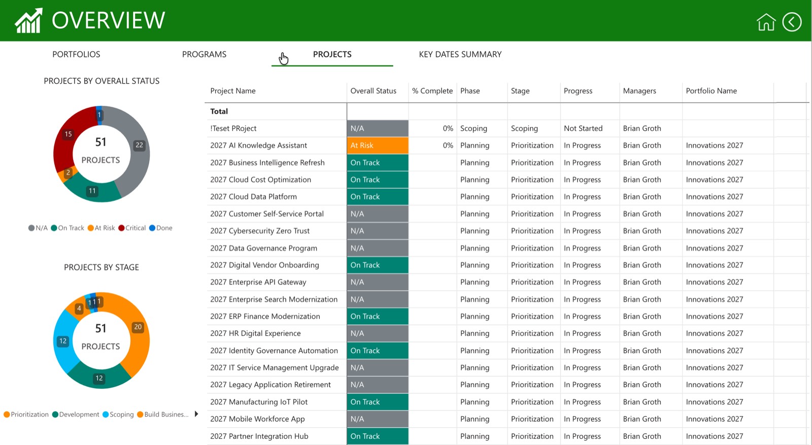
Notice what this table does that a Planner Charts export doesn't: it names one specific decision per plan, not a generic risk description, and it separates "on track, nothing needed from you" from "needs your call this week." An executive can scan five rows and know exactly where to spend the next ten minutes of attention: the Warehouse Automation and European Expansion rows, without opening either plan.
Planner Agent, Power BI, or a hosted rollup: a fair comparison
There are three real paths to a view like the one above, and each is genuinely good at something different. None of them is a strawman.
1. Planner Agent (native, in-plan). Microsoft's Planner Agent already generates automatic status reports for shared Basic and Premium plans. This is real, shipped functionality, and for a single plan it's genuinely useful: no setup, it drafts a status summary from the plan's own task data, and it improves as Microsoft develops it further. Where it stops is scope. It reports on one plan. It doesn't roll five plans into one prioritized view, and it has no mechanism for ranking "which of my at-risk plans needs my attention first" across a portfolio, because that ranking requires data and context Planner Agent doesn't have access to outside the plan it's summarizing.
2. Power BI, self-built. This is the honest DIY path, and it's more capable than either native option: you own the model, visuals, and refresh schedule entirely. PPM Express publishes a Planner report-pack setup guide for Power BI that walks through connecting to Planner data via the Graph API. The friction is real: it requires Power BI Desktop, a workspace, an API token or app registration, and a maintained refresh schedule that someone has to own and that breaks when Graph API permissions change. For a data-mature organization with an analyst on staff, this is a strong option; without that support, it's a real project, not a report.
3. A hosted portfolio layer. The third path is a tool that maintains the connection to your plans and keeps a report format current without you rebuilding a data model. The trade is less flexibility than a custom Power BI build, in exchange for far less setup. PPM Express integrates with Microsoft Planner and works this way: a maintained cross-plan view without a Power BI project behind it. In practice, that's what most teams mean when they ask for a Microsoft Planner dashboard: something that's already there when the plans change, not a file someone has to rebuild every quarter.
Worth naming too, since it comes up: ChatGPT can already reach Planner data today through custom MCP apps, which is a fourth, more technical variant of the "build it yourself" path. It's useful if you're comfortable wiring up that connection, with the same ownership trade-offs as the Power BI route.
What a Planner connector gives you: one report, shared manually
It's worth being precise about what connecting PPM Express to Planner actually gives you today. PPM Express integrates with Microsoft Planner to provide a maintained cross-plan portfolio view, a standard portfolio-review report format, owned risk and issue records you can track outside any single plan, and light resource planning. The report is real and reusable, but sharing or exporting it today is a manual action you take when you need it, not a schedule. Automated, recurring distribution, a report that lands in an inbox every Monday without anyone opening the tool, isn't part of that yet.
It's worth being explicit about that rather than let a reader assume a connected report is automatically scheduled. For a monthly or ad hoc executive review, manual export is a small cost. For a weekly cadence to a distribution list, it's the point where scheduling starts to matter.
Frequently asked questions
Can Planner Agent build an executive rollup across multiple plans?
Not on its own. Planner Agent already generates automatic status reports for shared Basic and Premium plans, and it does that well, but each report is scoped to the plan it's summarizing. It has no native mechanism for combining several plans into one prioritized executive view or for ranking risk across plans it isn't attached to.
Does Planner Premium's Portfolios feature solve this?
Partially, and it's worth using if you're already on Plan 3 or Plan 5. A Planner Portfolio rolls up tasks from several Premium plans into one view, and Microsoft allows other qualifying users shared read-only access to it. What it doesn't hold is risk, budget, capacity, or decision context. It's a task aggregation, not an executive report.
Is building a Power BI report the better free option?
It depends on what "free" means to your organization. There's no licence cost if you already have Power BI, but the real cost is setup and upkeep: Power BI Desktop, a workspace, an API token or app registration, and someone who owns the refresh schedule and fixes it when Graph API permissions change. A hosted connector like PPM Express skips that setup work, since the rollup is already there once you connect a plan, which is a different kind of "free": free of the project, not necessarily free of a subscription. Which one actually costs less depends on whether you already have a Power BI analyst on staff or would be starting that build from scratch.
Does an executive rollup from Planner include budget or cost data?
No. Planner tracks tasks, assignees, and due dates. It has no native cost or budget field, and a task being complete says nothing about what it cost. Any budget view has to come from data entered or connected outside the plan itself.
Can task-completion percentage double as a resource-utilization metric?
Not reliably. Task counts measure what's been marked done, not how much capacity someone has used or has left. A person can be at 40% task completion and fully booked, or at 90% and idle. Utilization requires a capacity model against actual working hours, which sits outside what Planner tracks.
Is building executive reporting around Project Online still a safe bet?
No. Project Online is retiring 30 September 2026, so any reporting approach built around it needs a replacement plan now, not after the fact. That's part of why more portfolios are consolidating around Planner and Project for the web as the forward path.
If assembling a trustworthy executive view across several Planner plans is the problem in front of you this quarter, PPM Express's standard report format is a reasonable place to start before committing to a custom Power BI build: connect your plans and see the rollup against your own portfolio, no setup project required.
.svg)


